How Icons Can Be More Effective in Product Design
Introduction
Ever wonder how an icon comes to life? Who decides which ones take over our screens? Or how they evolve from mysterious little symbols into universal signs we instantly recognize?
Take the Bluetooth icon. Back in the 10th century, there was a Danish king named Harald Blåtand—or Harald Bluetooth if you're feeling fancy. He was famous for two things: uniting Scandinavia and eating so many blueberries his teeth turned blue. Fast forward a thousand years, and his legacy of bringing things together lives on. The Bluetooth logo we use today is actually a mashup of the ancient runes for “H” and “B”—Harald’s initials.
Icons like Bluetooth, the trash can, the floppy disk (yep, that’s what the Save icon is), and the magnifying glass are all built to do one thing: communicate meaning fast. If you’re curious about how icons become tiny but mighty symbols—or want your own designs to speak louder than words—this is your kind of story.
Icons as Functional Design Elements
Have you ever thought about why dragging something to the little “trash bin” on your computer feels so obvious? Or why spotting a magnifying glass instantly makes you think, search mode: activate? According to Roxanne Boutin in The Psychology of Icons, it’s not random at all. Icons aren’t just doodles—they’re deliberately crafted with a deep understanding of psychology, signaling a specific activity, purpose, or task.
Psychology + Design = Icon Magic
Icons get their power from a clever mix of psychology and design theory. This fusion shapes the way we interact with technology—and, honestly, the world. The magic formula? Keep it simple, make it intuitive, and be super aware of cultural context. It’s not just about making pretty symbols; it’s about sending clear, universal signals that anyone, anywhere can pick up on without missing a beat.
Take the Play button. We all know what it means, but it’s not like triangles naturally scream start music. As Valeria Santalla explains in 5 Confusing Icons and Their History, the Play symbol took off thanks to the global boom of consumer electronics. Over time, it just stuck.
Santalla puts it perfectly: “While there might have been a logical grounding once (like how the Gmail logo is a letter), that time is long past. It’s an abstraction, an idea everyone agrees means play.”
What Happens When Icons Get Old?
What happens when the world moves on and icons don’t?
Cue the Save icon—aka the floppy disk that half of Gen Z has never even seen. In Icons, Evolution, and Inclusivity, Patricia Garcia Soto tracks how the Save icon has slowly morphed into folders, arrows, and boxes over time. For some people, the old-school floppy still clicks. For others, it’s a total mystery. The icon’s symbolic meaning no longer signifies that task.
Icons work best when they’re simple, fast, and crystal clear. But what happens when the thing they’re based on fades from memory? How long until the camera icon stops meaning “take a photo” once physical cameras disappear? Or the clock face no longer screams “time” in a world of digital everything?
Icons need to move with us. They’re not just tiny pictures—they’re silent ambassadors for your product. A well-designed icon guides, reassures, and leaves a mark. A confusing one? It leaves users scratching their heads.
The Secret Sauce of Icon Design
So, what separates an awesome icon from a forgettable one? Three things: simplicity, clarity, and recognizability.
Icons should be clean, focused, and free of random little details. As Tara Horner puts it in Best Practices for Icon Design, too much fuss and you’ve lost people. Good icons should snap into place in your brain in five seconds or less. Otherwise, that symbol-to-action connection is too weak to work.
Why Bother With Icons?
Icons aren't just for decoration—they’re the MVPs of user experience. Roxanne Boutin lays out why you absolutely want them on your side:
They’re instantly recognizable
Familiar icons help users move fast without overthinking.
They save space
Especially on mobile, where functionality needs to fit without clutter.
They make great touch targets
Big enough for fingers, precise enough for a mouse.
They’re (almost) universal
A good icon speaks across languages and cultures.
They make everything prettier
Let’s be honest—clean, stylish icons just make products feel better.
Establishing a connection between an icon’s function and its symbolic meaning across space and time makes sense. But is there room for novelty in icons? When is it okay to break the mold?
On Standardization and Consistency of Icons
When you think about “liking” something, what pops into your head? The thumbs-up from Facebook or YouTube? Or maybe the heart from Instagram or TikTok?
There’s no right or wrong answer—after all, “liking” can be represented in many different ways, depending on the platform. Some actions, like using the pencil icon to represent “edit,” have mostly settled into universal standards. But other actions? That’s a whole other story.
Leveraging the Familiar
It’s safe to say we’ll keep seeing different icons used to represent the same action—or one icon doing double duty across platforms. But here’s the key: don’t reinvent the wheel for things that already work. Take a peek at what competitors are doing and see what your users are already familiar with. Your users are more likely to appreciate a good old-fashioned trash can icon for “delete” than something completely new and confusing.
Staying Consistent
Visual consistency within your own product is what really matters. Whether you use an existing icon library or build your own from scratch, getting the visual style right from the start is crucial. You’re setting the stage for how users will interact with your interface.
Libraries like Font Awesome or Material.io make it easy to create a consistent, recognizable style. And, let’s face it—they’re pretty helpful when you’re short on time. Plus, they come pre-loaded with universally understood icons, making them a solid choice for many projects.
Benefits of Icon Design Libraries
The right icons can do more than just point to actions—they can build trust, loyalty, and a stronger emotional connection with users. If you choose to use an existing library, here are some perks:
They play nice everywhere
Web, mobile, desktop—your icons stay sharp and consistent.
They speak fluent icon
Built on well-known patterns, so users just get it.
They save your sanity
Pre-made and ready to go when you’re short on time (or patience).
They flex with your style
Need to tweak size, color, or stroke? Libraries bend, not break.
They scale with you
From five icons to five hundred, they grow with your product.
But a word of caution
Don’t just throw in a generic icon because it’s easy. If your brand depends on a specific look or feel, it’s worth the extra time to craft a custom icon set. These small design decisions can set your product apart—making it not only more usable but also more memorable. Just be sure to dry-run icons with your core audience to gut-check recognition. User testing (we’ll get into that in a minute) is essential here.
Icons vs. Text
It’s important to understand when to use icons, text, or both. Always consider your audience. Are they using your platform on desktop or mobile? Is it global? Knowing the answers to these questions will guide your decisions.
Visual Appeal
Icons can shine in mobile interfaces. They use less space, support cleaner designs, and create a visually engaging user experience. Recognizable icons help users navigate unfamiliar apps or sites with ease. And for global audiences, icons can eliminate the need to translate certain elements.
Text Appeal
While text may be less visually engaging, it offers clarity. Text removes uncertainty—users don’t have to guess what an icon means. Not all icons are as universal as the trash can, and ambiguous icons can create confusion. Some users, especially those less familiar with tech, may misinterpret an icon.
Text also improves consistency and accessibility. It’s often more screen reader–friendly and easier to navigate than icons. And while universal icons can bridge language gaps, not all icons are instantly understood. Translation takes time, but it ensures clarity.
The Takeaway
Ultimately, deciding between text, icons, or both comes down to one thing: knowing your users. Icons enhance visual appeal, conserve space, and reach broader audiences. Text removes ambiguity, improves accessibility, and guarantees clarity. When in doubt, test your choices with real people.
And that’s what we’ll talk about next.
The Role of User Testing in Icon Effectiveness
Even the most beautifully designed icon is useless if no one understands what it means.
That’s where user testing comes in. Testing icons isn’t just a “nice-to-have”—it’s essential to making sure your designs work for real people, not just design teams.
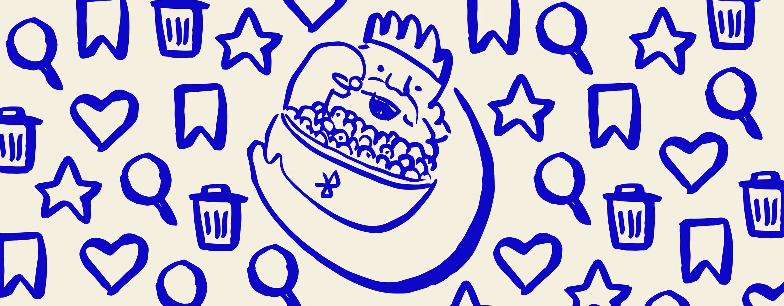
Picture this: you’re cruising to work, coffee in hand, your favorite podcast vibing through the speakers. Life’s good—until a strange icon pops up on your dashboard. It kind of looks like... a lightbulb? Or maybe a witch’s cauldron bubbling over? Hard to say. But hey, the car feels fine, and you’re already running late, so you shrug and keep driving.
Fast forward to the end of the day. You’re tired, dreaming about dinner... and there it is: your front tire, flatter than a pancake. Turns out that little mystery icon was a low tire pressure warning. Oops. If only it had made more sense the first time.
Why Test?
Because you’re not your user. You might know that a little flag icon means “report,” but your users might think it means “save for later.” A lightning bolt might scream “boost” to some, and “danger” to others. Icons can be interpreted in wildly different ways based on culture, experience, and context.
Like the story about the bubbling cauldron (adapted from Micah Bowers), when icons aren’t crystal clear, users are left guessing—and guessing rarely ends well. Whether it’s a car dashboard or a mobile app, we rely on icons because pictures are faster than words. Way faster. Neuroscientists at MIT found that your brain can process an image in just 13 milliseconds. That’s faster than a blink.
In design—especially where space is tight (think phones, smartwatches, dashboards)—icons do a lot of heavy lifting. But simply adding an icon doesn’t guarantee it’ll work. To ensure an icon actually helps your users, you have to test it. User testing surfaces those differences before they become bigger problems.
What to Test
Recognition
Can users correctly identify what the icon is meant to do?
Recall
After using it once, can they remember what it does later on?
Reaction time
How long does it take them to understand it?
Confidence
Are they guessing, or do they feel sure about it?
Action
Do they click the right icon for the task they’re trying to complete?
Even quick A/B tests or hallway tests (grab a colleague!) can uncover surprisingly useful feedback.
How to Test
Surveys or preference tests
Show different versions of an icon and ask users what they think it means.
First-click tests
See where users click first when asked to complete a task.
Task-based usability testing
Watch users try to perform real tasks and observe where they hesitate or go wrong.
Card sorting
Ask users to match icons with their intended meanings.
Accessibility reviews
Make sure your icons still work for people using screen readers, or those with visual or cognitive impairments.
Don’t wait for launch day to find out your shiny new icons don’t make sense. Integrate icon testing into your design process early and often—it can save you hours of redesigns later.
Icon Testing in Action
Let’s say you’re designing a new feature that lets users “bookmark” an article to read later. You create three icons: a star, a ribbon, and a bookmark tab. Which one should you go with?
Instead of guessing, you run a quick unmoderated test with ten users. You ask: “Which icon do you associate most with saving something for later?” Eight out of ten choose the ribbon.
Boom. Now you’ve got real data to back up your design decision—and confidence that your users will actually get it.
And remember: a little testing up front can save your users from a lot of “You’ve gotta be kidding me!” moments later.
Accessibility Considerations
Have you ever thought about “editing” the world like we edit our Figma files—constantly iterating to make things better, clearer, more inclusive? What if we could version and rename the world like our design files: V1, V2, Final, RealFinal?
That’s the spirit Sara Hendren and Brian Glenney brought when they reimagined the standard wheelchair accessible parking sign. They didn’t just tweak the design—they gave it motion. The original static figure became active, leaning forward in motion, expressing agency and momentum.
But this wasn’t just an aesthetic update. It was a spark for deeper questions: How do our environments reflect—or ignore—the people who move through them? What messages do our signs send about who belongs, who’s visible, and who’s empowered?
Accessibility is about more than compliance. It’s about dignity, representation, and designing a world that includes everyone. By changing a simple icon, Hendren and Glenney made people stop and think. That’s the power of design—to shift not just pixels, but perspectives.
Icons and our users
Icons need to aim to be recognized not just by most people but by everyone. There is an assumption that universal icons are always understood by users, but that’s not always the case. While we rely on universal icons because most users will understand them, we can’t forget that there will be users who don’t immediately interpret that trash cans mean delete and pencil mean edit. This can be due to a number of factors such as culture, age, and cognitive ability.
Make Your Icons Inclusive: A Quick Guide
Size matters
Ensure icons are large enough to be easily tapped or clicked, especially on touch devices, aiding users with motor impairments.
Alt text FTW
Provide concise alternative text for icons, enabling screen reader users to grasp their function.
Contrast counts
Use high-contrast colors to make icons distinguishable against backgrounds, assisting users with visual impairments.
Keep it simple
Design icons that are straightforward and easily interpretable, reducing cognitive load for all users.
Label when needed
Accompany icons with text labels when their meaning isn't universally recognized, enhancing clarity.
Keyboard-friendly
Ensure icons are accessible via keyboard navigation, catering to users who rely on non-mouse inputs.
Consistent styling
Maintain a uniform visual style across all icons to provide a predictable and understandable interface.
Test with users
Conduct usability testing with diverse user groups to identify and rectify accessibility barriers.
It is important to consider the differences between universal design and inclusive design when it comes to accessibility. Universal design aims to create a singular solution that works for as many people as possible. But inclusive design describes methodologies to create products that understand and enable people of all backgrounds and abilities. The focus is on fulfilling as many user needs as possible, not just as many users as possible.
By adhering to these practices, you align with the WCAG's POUR principles, ensuring your icons are accessible and inclusive for all users. As always, keep up to date with accessibility guidelines and evolve what is best for your users as you learn more.
Final Thoughts
From ancient runes to binary code, icons have always been more than decoration—they’re functional design elements built to communicate meaning at a glance. But for icons to actually work, they need more than just good looks. They need to be consistent, easy to recognize, and tested with real users. Whether you’re choosing icons from a design library or crafting your own from scratch, it’s all about clarity, context, and care.
Standardizing your visual language helps users build trust, and user testing ensures those tiny symbols actually mean what you think they mean. And let’s not forget accessibility: a well-designed icon doesn’t just look good—it works for everyone. Because at the end of the day, great icons aren’t just visual flourishes. They’re tiny ambassadors of meaning, guiding people through products, interactions, and experiences—one pixel at a time.
Written with Christie Sohn